
Apparently there was some controversy in 2019 over Pantone choosing Living Coral as their Color of the Year because healthy living coral is in short supply. I thought the color coral worked just fine in the garden but then Classic Blue won the top honor last year. For 2021 the Pantone Color of the Year is a warm grey and a warm soft yellow. Kinda reminds me of a 1950?s kitchen but hey, what do I know? In the garden they work just fine and here?s why.
Many of our low water use plants have grey or silver foliage. That?s to enable the leaf to reflect the heat of the day to preserve moisture. Plus gray and silver combines with both warm and cool colors so it?s easy to place. It’s an effective peacemaker between colors that would clash if placed side by side. Plants like dusty miller, blue oat grass, leucophyllum, westringia, santolina, pittosposrum ?Silver Queen? all look great in the garden.
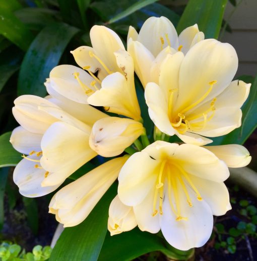
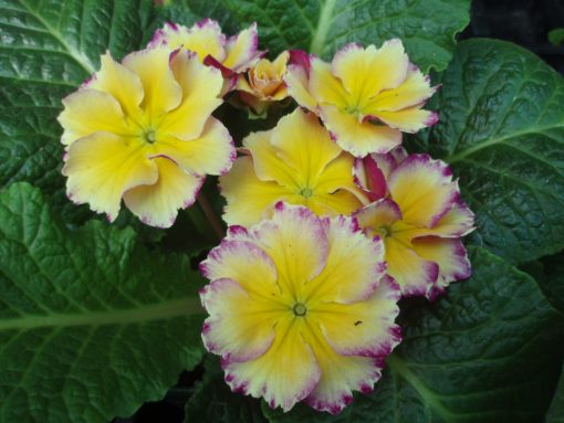
While it still has the cheeriness of other yellows, pale yellow is a much more gentle color. Plants with soft warm yellow flowers might include Lady Banks roses, clivia, yellow-eyed grass, daylily, peony, narcissus, yarrow, verbascum, primroses and canna lily.
Warm colors tend to be more stimulating, dynamic and noticeable from afar than cool hues which are more calming and understated. Warm colors advance visually, cool ones recede. So to make a small garden appear larger use cool blues and lavenders in the back with just a touch of scarlet, orange or yellow up close for contrast. Do the opposite to make a large space more intimate – position warm colors at the back, cool colors in front.
Garden colors aren’t static either. They vary with time of day, the season, the weather and the distance from which we view them. Also color perception varies among people and not all people with normal vision see color the same way. Since color and light are inseparable, white, yellow and pastels seem more vivid in low light. In overcast or fog, soft colors like pink, creamy yellow, pale blue and lavender come alive. As night approaches and the earth is bathed in blues and violets, those colors are the first to fade from view.
Have fun with color. don’t be afraid to try new combinations. I often hear people say “I like all the colors except orange”. Orange naturally combines with blue as these ‘sunset’ colors are opposite each other on the color wheel. Think how nice bright orange California poppies look with blue marguerites or peach Iceland poppies with blue violas.
Foliage is a rich source or garden color. You can find plants with yellow, red, purple, blue or gray foliage as well as shades of green with variegated, marbled or streaked leaves.
Plants grow and gardens change over time. Realize that you’re embarking on a journey that may take many years. Don’t be afraid to play with color even if you don’t get it right the first time. Just learn from your mistakes and make adjustments. And have fun getting there.